Graphic Design with character and purpose.
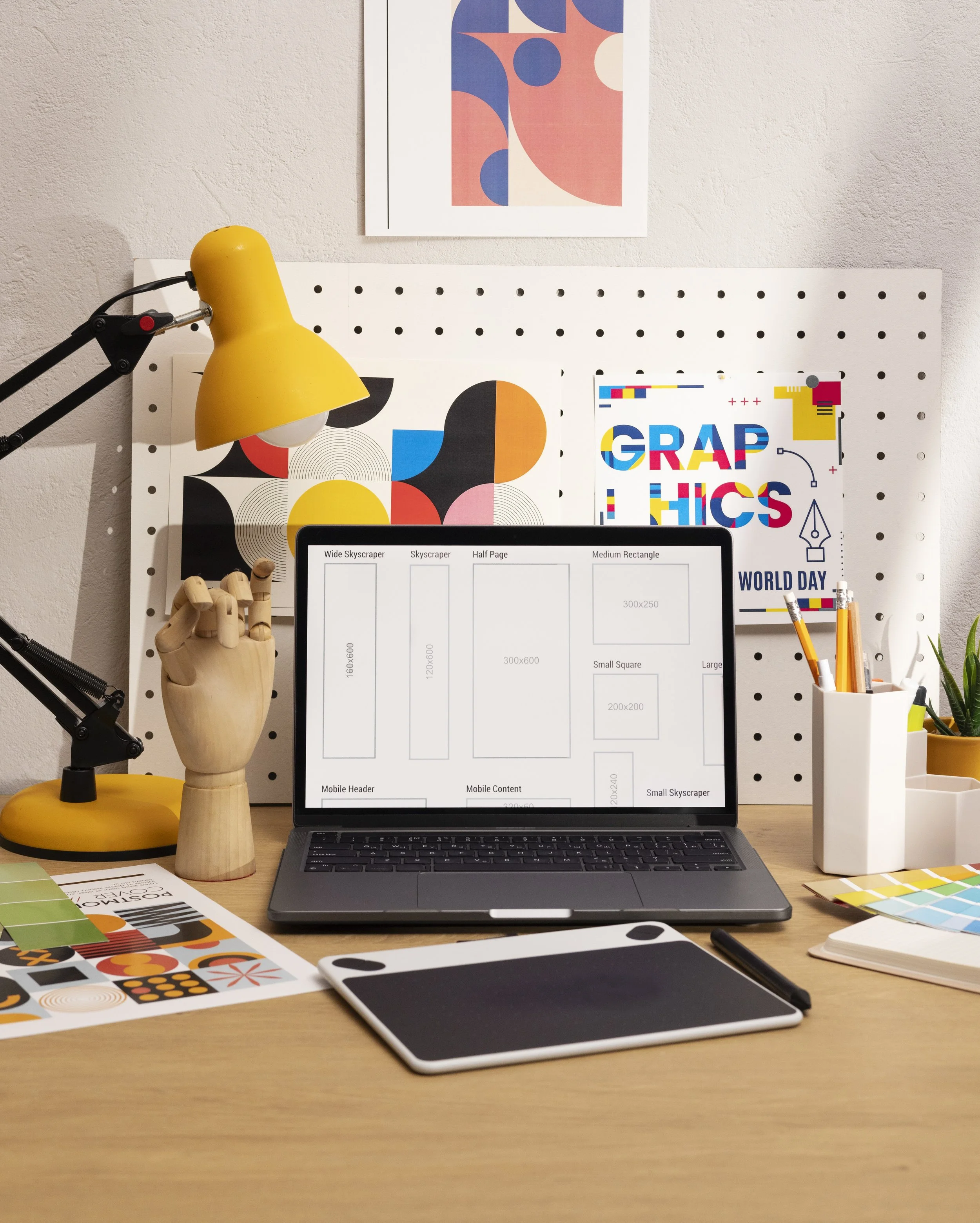
Great graphic design has a job to do. My background in UX means I think beyond how a design looks and into how it functions, how people interact with it, and where it will ultimately be used. I’m comfortable designing for both digital and physical applications, with an understanding of formatting, responsiveness, production requirements, and print best practices.
I can help you with Design + Production
My access to professional print equipment through Honolulu’s creative community gives me an additional understanding of what happens after a design leaves the screen.
-
Web Graphics · Social Media · Responsive Assets · Marketing Materials · User Interface
-
Print Design
Brochures · Flyers · Business Cards · Signage · Promotional Materials · Catalogs/Line Sheets · Other business collateral
Large Format Printing (with access to a Roland LEC-640 UV Printer)
Banners · Posters · Window Graphics · Large Signage · Wall Clings
Selected Work
Mālama i nā honu + Turtle Wines Campaign
Client
Davis Hess, Mālama i nā honu Nonprofit
Year
2026
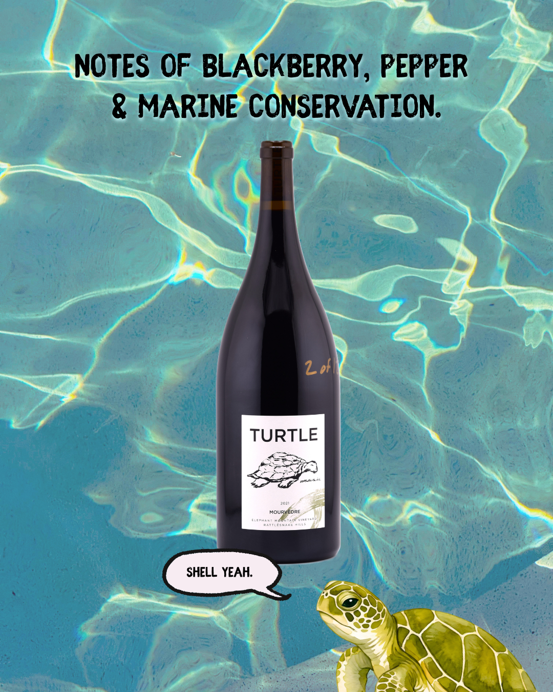
Mālama i nā honu and David Hess Turtle Wines partnered to raise awareness and support for marine conservation through a purpose-driven wine sales campaign.
-
-
My goal was to design something that looks good and makes people care.
I designed the graphics to feel playful, approachable and a little humorous while keeping the mission at the center. The audience already had a strong connection to marine life, so I leaned into that emotional investment rather than treating the campaign like a traditional advertisement.
I also considered the audience surrounding the wine community: people who appreciate good design and storytelling, but who may also be looking for meaningful ways to support causes they care about. The result was a visual approach that made the mission feel inviting rather than heavy-handed.
In other words, the graphics were designed to make someone smile, understand the cause, a think “Hey, I want to be a part of that.” -
A campaign that kept going! Originally planned through the end of this year (2026), the campaign was extended to at least a full year after generating strong sales.
Chomp Change Mobile App
Client
DesignLab, UX Apprenticeship
Year
2025
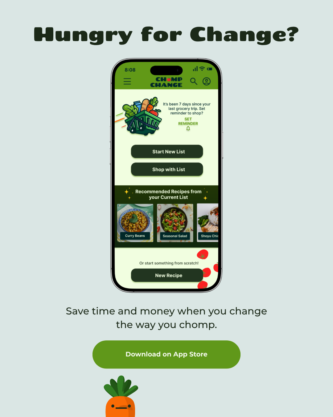
An app designed around the real world need to eat healthy on a budget. Full case study available upon request!
-
Chomp Change was a student UX/UI project completed as part of my UX education. While it was a school project, I took the product through the full design process from initial research and problem definition ideation, user flows, wire frames, visual design, prototyping, and usability testing.
The goal was to create a budgeting experience that felt approachable and encouraging rather than intimidating for a user group that lacks confidence around healthy meal planning.
-
I started researching the challenges people face when trying to manage their spending and identifying opportunities to make budgeting feel more approachable. From there, I translated those insights into user flows and low-fidelity wireframes before developing the visual direction and interactive prototype.
This project was also a turning point in how I understood my own design practice. I realized that my background in illustration and visual design wasn’t separate from UX, but a superpower within it! I can use visual storytelling, character, color, and personality to make a product intuitive and genuinely delightful to use.
-
The final prototype brought together research-driven UX decisions with a playful visual identity and approachable interface. Most importantly, the project helped define the kind of designer I want to be: someone who combines strategic thinking, usability, and visual personality to create experiences that are both effective and enjoyable.
Although Chomp Change was created as a student project, it remains one of the most meaningful projects in my portfolio because it demonstrates how my visual design background strengthens my product design work.
SurfJoy
Client
Personal/ Self-initiated
Year
2020-Present
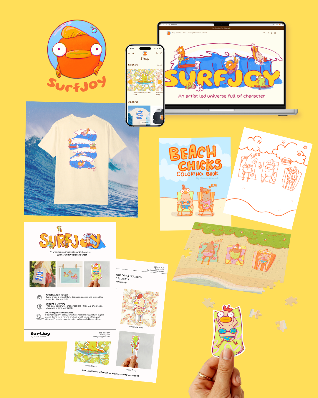
SurfJoy is an artist led creative property inspired by life in Hawai’i. The project explores the development of a cohesive visual identity across illustration, merchandise, print, digital experiences, and retail.
-
All of it. Seriously. SurfJoy started as an illustration project and grew into a full creative property, so I’ve had the opportunity to design nearly every touchpoint of the brand— from visual identity and illustration style to merchandise, packaging, promotional materials, web experiences, wholesale materials and social content.
-
I built SurfJoy around a recognizable visual language: playful characters, expressive illustration, bold color and a sense of humor that carries across all formats.
As the brand expanded, I treated each new piece as a part of the same ecosystem. From stickers to mailers, product displays and social graphics, every piece is able to stand on its own while feeling unmistakably connected to everything around it. I designed for cohesion and thinking beyond individual graphics to consider how a customer experiences a brand as a whole.
-
SurfJoy has grown from an illustration concept into an active creative property, with products placed in local retail stores, an ongoing mail club, and new opportunities in publishing currently being explored.
The project continues to evolve alongside me. Building and maintaining the SurfJoy brand has become an ongoing opportunity to learn, experiment, play, and explore how illustration can move across products, storytelling, retail and digital experiences.